Frutiger Aero, an aesthetic, typeface, and design trend, emerged in the 2000s following the turn of the millennium and Y2K, particularly in the fashion and product design industries.
The following provides a detailed analysis of the Frutiger Aero aesthetic, including its origins, influences, and other notable characteristics.
The Frutiger Aero aesthetic was influenced by a number of sociopolitical, cultural, and economic factors of the late 1990s and early 2000s. One key influence was the rise of digital technology, which was transforming the way people lived and worked. This emphasis on efficiency and speed was reflected in the clean lines and minimalist design of the Frutiger Aero aesthetic.
Another influence was the growing awareness of environmental issues and the need for sustainability. The Frutiger Aero aesthetic often incorporated highly saturated and vibrant images of nature, eco-friendly materials and finishes, such as recycled plastics and natural fibers, as well as energy-efficient lighting and other features.
Finally, the Frutiger Aero aesthetic was influenced by the broader cultural and economic context of the turn of the millennium. This was a time of great change and uncertainty, with the dot-com bubble, the 9/11 attacks, and the global financial crisis all occurring within a relatively short span of time. The Frutiger Aero aesthetic reflected a desire for stability and order in the face of these upheavals, as well as a sense of optimism about the future.
Influences
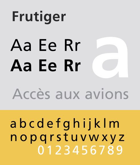
The Frutiger Aero aesthetic takes its name from the typeface designed by Adrian Frutiger in 1968, which was used extensively in the design of airport signage and wayfinding systems.
The typeface has a clean, modern look that reflects the streamlined design of airport architecture and technology, and its popularity in the aviation industry helped to establish its association with modernity and efficiency.
In the late 1990s and early 2000s, designers began to adopt elements of the Frutiger typeface and airport design more broadly in their work, creating a distinct aesthetic that combined sleek, minimalist lines with high-tech materials and finishes. This aesthetic was particularly popular in the fields of fashion and product design, where it reflected a desire for futuristic, cutting-edge design.
The Frutiger Aero aesthetic is characterized by a number of distinctive features. One key feature is its use of clean, minimalist lines and shapes. This often takes the form of simple geometric shapes, such as circles, squares, and triangles, which are combined in interesting and innovative ways to create complex designs.
Another characteristic of the Frutiger Aero aesthetic is its use of high-tech materials and finishes. This might include metallic or mirrored surfaces, sleek plastics, and other materials that reflect the futuristic, cutting-edge nature of the aesthetic. The use of LED lighting and other high-tech features is also common.
As opposed to Frutiger Aero digital aesthetic, in Frutigero Aero interior design, color is often used sparingly, with a preference for monochromatic or limited color palettes that emphasize the clean lines and shapes of the art and furniture. When color is used, it is often bold and vibrant, with a futuristic, almost neon quality.
Finally, the Frutiger Aero aesthetic often incorporates elements of nature and the environment, reflecting the growing concern for sustainability and eco-friendliness. This might take the form of organic shapes or materials, such as wood or natural fibers, as well as the use of plants and other natural elements in interior design.
The Frutiger Aero aesthetic was most popular in the late 1990s and early 2000s, particularly in the fields of fashion and product design.
It was associated with a sense of optimism and excitement about the future, as well as a desire for stability and order in the face of uncertain times. While the aesthetic has evolved and changed over time, elements of the Frutiger Aero style continue to be used today in various design fields, particularly in digital and web design.
The clean lines, geometric shapes, and sans-serif lettering of the Frutiger Aero style convey a sense of modernity and simplicity, making it an ideal choice for designs that prioritize functionality and ease of use. The bold, sans-serif lettering of Frutiger Aero is often used in branding and logo design, while the geometric shapes and patterns are popular in product design and packaging.
Despite its association with a particular era, the Frutiger Aero style has proven to be enduring, with designers continuing to incorporate its elements into their work today. Its timeless appeal and adaptability make it a versatile and valuable addition to any designer’s toolkit.
Frutiger Aero quickly became popular in the airline industry, and it was widely used by airlines around the world throughout the 1980s and 1990s. Its popularity was due in part to its functional design, but it was also influenced by broader cultural and economic trends. The 1980s were a time of optimism and growth in many parts of the world, and the clean, modernist aesthetic of Frutiger Aero was seen as a reflection of this optimism.
The influence of Frutiger Aero can also be seen in other areas of design, such as advertising, graphic design, and architecture. Its clean lines and modernist aesthetic have been used in a variety of contexts, and it remains a popular typeface today.
In conclusion, Frutiger Aero is a unique and influential typeface that was developed during a time of rapid change in the aviation industry. Its functional design, influenced by the modernist movement, made it easy to read and recognize in the high-stress environment of commercial aviation, and it quickly became popular among airlines around the world. Its influence can be seen in a variety of design contexts, and it remains a popular typeface today.
Frutiger Aero is a typeface designed by Adrian Frutiger, a Swiss typeface designer and typographer, in 1985.
The design of Frutiger Aero was influenced by the modernist movement of the 20th century, which was characterized by clean lines, geometric shapes, and a minimalist aesthetic. Frutiger Aero was designed specifically for use in aviation, and its unique design was inspired by the need for a typeface that would be legible in the high-stress and high-speed environment of commercial aviation.
Frutiger Aero was developed during a time of rapid change in the airline industry. In the 1980s, airlines were undergoing a transformation from state-owned entities to privately owned businesses, which led to increased competition and a focus on efficiency and profitability. The use of technology was also becoming more prevalent in aviation, with advances in radar and computer systems leading to a need for typefaces that could be read easily by both humans and machines.
Frutiger Aero was designed with these changes in mind, and its unique shape and design were intended to make it easier to read and recognize in the high-stress environment of aviation. The typeface features a clean, modernist design with wide, open characters that are easy to distinguish from one another. The letters are also designed with a unique shape that makes them easy to read at a distance or at high speeds, which is essential in aviation.
What Else Was Cool During Frutiger Aero?
The Frutiger Aero aesthetic and the “McBling” aesthetic emerged around the same time, but they are distinct design trends with different influences and characteristics.
The McBling aesthetic, also known as “bling bling,” emerged around 2003 thanks to hip-hop culture, particularly in the United States. It is characterized by the use of flashy, ostentatious materials such as gold and diamonds, often used in excess to display wealth and status.
In contrast, the Frutiger Aero aesthetic is characterized by minimalist, high-tech designs that emphasize efficiency and sustainability. While both trends emerged around the turn of the millennium, following Y2K, they represent different cultural and social influences.